Rock experience site · end-to-end motion design
ROCKVERSE
Problem
Music and culture brands fight for attention in seconds, and ordinary websites create no desire, memory or shares.
Solution
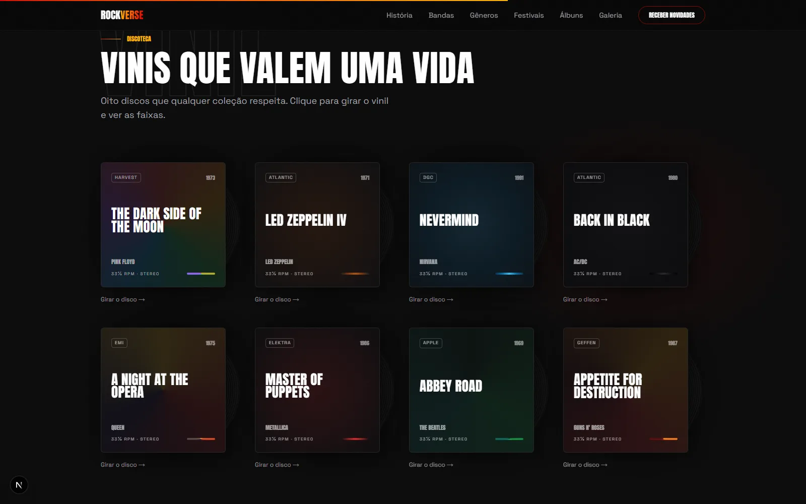
An immersive journey through rock history: letter-by-letter kinetic headline, inertia scrolling (Lenis), contextual cursor, interactive vinyl sleeves with modal, scrubbed timeline and a paper editorial section. The project was audited as if I were an awards juror and refined across 5 phases, keeping a 99/100/100/100 desktop Lighthouse.
How it was built
ROCKVERSE's motion isn't a stock library switched to autopilot. Scroll runs through Lenis (lerp 0.1, smoothWheel) and the native CSS scroll-behavior: smooth is explicitly off, so the two systems don't fight over the same frame. It's a subtle conflict: it only shows up when someone clicks an anchor link and the page "stutters" mid-scroll. The custom cursor (CustomCursor.tsx) only activates on pointer: fine, so touch screens never pay the cost. It uses a spring-physics ring (stiffness 250, damping 25) trailing a rigid point, and a data-cursor attribute on interactive elements swaps the label by context, like "SPIN" over a vinyl record. No unnecessary re-renders, since state only updates when the value actually changes (React's Object.is bail-out). The hero headline reveals letter by letter through a mask (overflow-hidden + translateY per motion.span, 35ms stagger per character) and reacts to mouse position with three-layer parallax: background, title and radial light, via useMotionValue + useSpring + useTransform. All of it with a full static fallback whenever prefers-reduced-motion is set.
What separates this from "yet another fadeUp site" is the set of scenes tied to scroll position itself, not just triggered by it. The decades timeline (History.tsx) has a gradient progress bar whose Y-scale comes from useScroll + useSpring over the whole section's progress, while each card runs its own local useScroll to parallax its image (-8% to 8%) and shift the year label sideways. On desktop the image stays sticky, which creates depth without WebGL. In the albums section, the vinyl records behind each sleeve spin as the user scrolls through the grid (useTransform from 0 to 180 degrees over the section's scrollYProgress), and only get a real animate-spin-slow once opened in the modal. The marquee divider goes further: instead of scrolling at a fixed speed, it applies a skewX derived from the scroll's instantaneous velocity (useVelocity on scrollY, mapped to -5°/5° through a spring). The text tilts more the faster the visitor scrolls. It's the kind of detail that only shows up on sites treating scroll as an instrument rather than a fade-in trigger.
Keeping a 99/100/100/100 Lighthouse score with this much motion took architectural decisions, not luck. app/page.tsx loads Hero, History, Navbar and the scroll-progress bar eagerly, which is what's visible above the fold, and wraps every other one of the nine below-the-fold sections (Bands, Instruments, Genres, Festivals, Albums, HallOfFame, Curiosities, Stats, Gallery, Newsletter, Footer) in next/dynamic. That way the initial bundle doesn't pay for code the visitor may never scroll far enough to see. The hero's ember particles (EmberCanvas.tsx) aren't Framer Motion components at all. They're a hand-rolled raw 2D canvas, with an IntersectionObserver pausing the requestAnimationFrame loop outside the viewport and a visibilitychange listener pausing it when the tab loses focus, plus devicePixelRatio capped at 2 and particle density halved on mobile. next/image uses custom quality tiers (qualities: [60, 75], the hero image explicitly pinned to 60) to cut LCP payload with no perceptible blur. And prefers-reduced-motion is handled in two layers: a global CSS kill-switch that zeroes every animation-duration and transition-duration, plus targeted useReducedMotion() checks inside components doing physics math (hero parallax, timeline, vinyl rotation). Without the second layer, the CSS media query would kill the transition but leave the underlying useTransform calculations running every frame.
What most sets the process apart is documented in docs/DESIGN-AUDIT.md: a self-audit of 20 issues, written as if an awards-show juror were grading the site ("overall verdict: 7.2/10"), covering hero, palette, typography, spacing, components and imagery, with an explicit 5-phase roadmap. Phase 4 of that roadmap, "Motion Design", listed exactly what was missing: Lenis, kinetic headline, scrubbed timeline, velocity-based marquee skew. That is literally what's implemented in the code today. Treating your own passion project like a demanding client, with a written audit, a priority table (P0 through P3) and a Lighthouse re-check after every phase, is what separates "we made a pretty site" from a repeatable design process.
Real-physics scroll
Lenis at lerp 0.1 replaces native scroll, with anchors recalculated through a navbar offset instead of hard jumps.
Letter-by-letter headline
Mask-based reveal with a 35ms stagger per character, plus three independent layers of mouse parallax.
Scroll-linked scenes
Vinyl records that spin with section scroll progress, and a marquee that skews with the scroll's instantaneous velocity.
99/100/100/100, no shortcuts
Per-section code-splitting, raw-canvas particles paused off-viewport, and reduced-motion handled in two layers.
More screens

Stack
- Next.js 16
- TypeScript
- Tailwind v4
- Framer Motion
- Lenis